July 19th, 2006
-
yet another service to share recommendations with friends
-
share product info with friends
-
to use with a Flickr account (anyone nervous about signing into services through other services?)
-
edit photos online
-
interesting uses of cell phones on college campuses across the country
-
Posted in Del.icio.us Links | Comments Off on Links for 2006-07-19
July 17th, 2006
Posted in Del.icio.us Links | Comments Off on Links for 2006-07-17
July 16th, 2006
Posted in Del.icio.us Links | Comments Off on Links for 2006-07-16
July 15th, 2006
Posted in Del.icio.us Links | Comments Off on Links for 2006-07-15
July 14th, 2006
-
Inside Higher Ed (Scott McLemmee) on the need for a service that aggregates academic blog content
-
Google Map with Africa Internet connectivity statistics
-
-
resume service; interesting way for them to gather lots of data about people including email and postal addresses
-
-
various video versions
-
Posted in Del.icio.us Links | 2 Comments »
July 10th, 2006
Posted in Del.icio.us Links | Comments Off on Links for 2006-07-10
July 9th, 2006
Posted in Del.icio.us Links | Comments Off on Links for 2006-07-09
July 8th, 2006
Posted in Del.icio.us Links | Comments Off on Links for 2006-07-08
July 6th, 2006
-
coverage of my gender skills paper in the Chicago Sun Times
-
“Free blogs for teachers, librarians, researchers, writers, lecturers and other professionals involved with education”
-
-
-
Posted in Del.icio.us Links | Comments Off on Links for 2006-07-06
July 5th, 2006
Posted in Del.icio.us Links | 1 Comment »
July 4th, 2006
-
LiveScience.com reports on my recently published work
-
collaborative mosaic design
-
government site with comparisons of cars on environmental factors
-
-
-
-
-
collect ideas in ajaxy fashion – Am not sure why all these services are coming out, this is pretty weak on functionality and why would you trust them to be there with your data the next day? That is, the basic idea may have potential, but is this going t
Posted in Del.icio.us Links | 1 Comment »
July 3rd, 2006
An image of a man who is definitely not a college student (certainly not traditionally aged) accompanies an article called “Men Assume Sexual Interest When There May Be None†in a recent piece by a HealthDay reporter, a piece that’s been published on various Web sites. (In case of link rot, I’ve placed a screen shot here.)
In the sixth paragraph of the piece we find out that the study is based on 43 male and 43 female college students aged 18-22. That is the only part of the article where the participants are referred to as college students. Otherwise, the entire piece is about the behavior of men and women generally speaking.
There are several fields that base a good chunk of their empirical research on studies of students.* This is usually done due to convenience. And perhaps regarding some questions, age and educational level do not matter. But the issue is rarely addressed directly. In many instances it seems problematic to assume that a bunch of 20-year-olds in college are representative of the entire rest of the population. So why write it up that way then? At best, in the conclusion of a paper the authors may mention that future studies should/will (?) expand the study to a more representative sample, but these studies rarely seem to materialize.
This is one of my biggest pet peeves when it comes to certain types of scholarship. And I do mean scholarship. Because it is not just the journalistic reports that make the leap. The academic articles themselves use that kind of language. It is part of a larger question that’s been of interest to me for a while now: Historically, how have various fields settled on what is acceptable empirical evidence in their domain and what are the appropriate modes of analysis? Papers that get into top journals in one field wouldn’t even make it off the editor’s desk for review in another field due to the data and methods used. But then when it comes to reporting findings to the public, it all becomes one big general pool of work where the methods and the validity of the findings don’t seem to matter anymore.
[*] Note that recently I have been doing studies on college students myself. First, I have a concrete substantive reason for doing so (they are the most highly network-connected age group, which helps to control for regular use). Second, when I write up the work, I never draw huge generalizations about all users. I always report on “college students†or “study participantsâ€. I do not simply conclude that whatever I find about college students is representative of all Internet users. It would be wrong to do so.
Posted in Research | 2 Comments »
July 1st, 2006

Looking for a summer [or insert appropriate season] hobby? Consider joining the Flickr Monthly Scavenger Hunt group!
Each month, you’re given a list of items for which you have to post photos. The challenge is made a bit easier by the fact that you can use photos taken at other times. (I think the really hard core version would not allow people to look in their archives, but it’s hard enough as is so it’s likely a reasonable rule.)
The July list has just been posted. It looks considerably harder than last month’s list, not that that was easy. I think for #8 “Hot pink” I can recycle my “Oink” entry from June. And probably few will have my particular take on #13 “Pest”. But what about entries like #11 “Most exotic animal for your location” or #14 “Road sign with wildlife on it”? This should be interesting…
Posted in Creativity, General update, Humor/Fun, Photos | Comments Off on Photo scavenger hunt
July 1st, 2006
Posted in Del.icio.us Links | Comments Off on Links for 2006-07-01
June 30th, 2006
-
-
list of Flickrish type of Web 2.0 site names
-
correspondance b/w scammer and recipient with interesting outcome
-
play against the computer (11 ships)
-
-
-
Posted in Del.icio.us Links | Comments Off on Links for 2006-06-30
June 29th, 2006
The newest photo set in my Flickr stream is called “In Flight“. I have flown 32,773 miles since January 1st this year. I boarded a plane 25 times so far in 2006. (It is not even because I started the year with a flight back to Chicagoland from NYC.) Since you can fly direct almost anywhere I go from Chicago, there has only been one trip that required a layover, when I was going from NYC to Santa Barbara via San Francisco (there) and Los Angeles (back). So I’ve been on 11.5 trips that required flying in less than half a year. Yikes.

Conveniently, I already had Premier status in United’s frequent flyer program even before the year began so I get even more miles in my account than I actually fly. There are additional perks. For example, I just found out on Sunday right before boarding the plane from San Francisco to Chicago, that I now have several e-upgrades, which entitle me to upgrades for no cost. So I conveniently got to spend the redeye in business class. It was great.
I’ve always wanted to fly on the upper deck of a big plane and I got to do it this time. It’s not that special, but it was still fun looking down at everything from even higher up (I don’t mean in flight, but while on the ground).
It’s good to know that San Francisco is another United hub. This means that they have a separate Premier check-in and security area that always cuts down on the wait so this next academic year when that becomes my home base airport, I can still get through check-in quickly.
Posted in General update, Products/Services, Travel | 6 Comments »
June 29th, 2006
Posted in Del.icio.us Links | Comments Off on Links for 2006-06-29
June 28th, 2006
No thanks to Jim Gibbon for siphoning off a few hours of my time today with that Gapminder pointer. Nonetheless, I wanted to send him a shutout and welcome him to blogging seeing that he comes from a bit of Crooked Timber lineage. Kieran and I shared an office for a couple of years while in graduate school at Princeton. And it is in this same office that Jim now spends a good chunk of his graduate student days (granted, right now he’s doing summer research in Germany). Welcome to blogging, Jim!
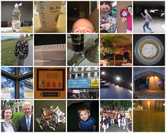
To try to decipher what it is about 129 Wallace Hall that leads to all this blogging, you can check out a light switch, a chair component, a scooter, part of the wall, parts of the building and its door for clues on this collage – all the product of an afternoon when I didn’t feel like working on my dissertation. Those were the days… You think you have no time in grad school, but then you become faculty and all that blogging, taking pictures and surfing the Net… oh, never mind.
Posted in General update | Comments Off on 129 Wallace
June 28th, 2006
Via Jim Gibbon I’ve discovered GapMinder. Wow! It’s a wonderful visualization tool for data. The focus is on world development statistics from the UN. The tool is incredibly user-friendly and let’s you play around with what variables you want to see, what you want highlighted in color, whether you want to log the data, what year you want to display, and whether you want to animate the time progression (oh, and how quickly).
I’ve made an example available on YouTube. (I used Gapminder to create the visualization and Hypercam to capture it.)
Here is some context for that particular graph. My first interests in research on Internet and social inequality concerned the unequal global diffusion of the medium. I wrote my senior thesis in college on this topic and then pursued it further – and thankfully in a more sophisticated manner – in graduate school. So this is a topic that has been of interest to me for a while and it’s great to be able to play with some visual representations of the data.
So what you have on the video graph is a look at Internet diffusion by income (logged) from 1990-2004. I picked color coding by income category, which is somewhat superfluous given that the horizontal access already has that information, but I thought it added a little something. (For example, to summarize the puzzle of my 1999 paper – the first to run more than bivariate analyses on these data -, it focused on explaining why all the red dots are so widely dispersed on the graph despite all representing rich long-term democratic countries.)
Thanks to the tool’s flexibility, you can change it so that the color coding signifies geographical region and could then tell immediately that what continent you are on – an argument some people in the literature tried to make – has little to do with the level of Internet diffusion.
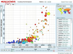
Imagine the possibilities of all this in, say, classroom presentations. Jim links to a great presentation using this tool. (Although I disagree with the presenter’s conclusion at the end about the leveling of differences regarding Internet diffusion.)
I recommend checking out the tool on your own for maximum appreciation of its capabilities.
Posted in Audio/Video, IT/Comm, Research, Soc/Pol/Econ | 2 Comments »
June 28th, 2006
-
-
annotate maps and post them on your Web site – looks great
-
“there really is no patch for human stupidity” – how about investing a bit more in training users?
-
-
-
-
-
people are not particularly rational in their spending, imagine that!
Posted in Del.icio.us Links | Comments Off on Links for 2006-06-28