
Data ain’t just for geeks anymore
Via Jim Gibbon I’ve discovered GapMinder. Wow! It’s a wonderful visualization tool for data. The focus is on world development statistics from the UN. The tool is incredibly user-friendly and let’s you play around with what variables you want to see, what you want highlighted in color, whether you want to log the data, what year you want to display, and whether you want to animate the time progression (oh, and how quickly).
I’ve made an example available on YouTube. (I used Gapminder to create the visualization and Hypercam to capture it.)
Here is some context for that particular graph. My first interests in research on Internet and social inequality concerned the unequal global diffusion of the medium. I wrote my senior thesis in college on this topic and then pursued it further – and thankfully in a more sophisticated manner – in graduate school. So this is a topic that has been of interest to me for a while and it’s great to be able to play with some visual representations of the data.
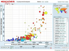
So what you have on the video graph is a look at Internet diffusion by income (logged) from 1990-2004. I picked color coding by income category, which is somewhat superfluous given that the horizontal access already has that information, but I thought it added a little something. (For example, to summarize the puzzle of my 1999 paper – the first to run more than bivariate analyses on these data -, it focused on explaining why all the red dots are so widely dispersed on the graph despite all representing rich long-term democratic countries.)
Thanks to the tool’s flexibility, you can change it so that the color coding signifies geographical region and could then tell immediately that what continent you are on – an argument some people in the literature tried to make – has little to do with the level of Internet diffusion.
Imagine the possibilities of all this in, say, classroom presentations. Jim links to a great presentation using this tool. (Although I disagree with the presenter’s conclusion at the end about the leveling of differences regarding Internet diffusion.)
I recommend checking out the tool on your own for maximum appreciation of its capabilities.
June 29th, 2006 at 12:22 am
[…] No thanks to Jim Gibbon for siphoning off a few hours of my time today with that Gapminder pointer. Nonetheless, I wanted to send him a shoutout and welcome him to blogging seeing that he comes from a bit of Crooked Timber lineage. Kieran and I shared an office for a couple of years while in graduate school at Princeton. And it is in this same office that Jim now spends a good chunk of his graduate student days (granted, right now he’s doing summer research in Germany). Welcome to blogging, Jim! […]
June 29th, 2006 at 8:03 am
Data fun for all the family
OK, I confess – I’m a data junky. So I am very thankful to Jim Gibbon (via Eszter Hargittai of Crooked Timber) for posting about Gapminder. It provides the best visualisation of data I have ever seen. Here is Jim’s post:I’ve been blown away this mo…